Core Concepts
1 min read
css3 UI
Button
实现3d按钮
.button-3d {
  position: relative;
  top: 0;
  box-shadow: 0 7px 0 #bbb, 0 8px 3px rgb(0 0 0 / 20%);
  border-radius: 4px;
}
.button-3d.button-action {
  box-shadow: 0 7px 0 #8bc220,0 8px 3pxrgba(0,0,0,.3);
}
.button-3d.button-action:active {
  box-shadow: 0 2px 0 #6b9619, 0 3px 3px rgb(0 0 0 / 20%);
}
.button-3d:active {
  top: 5px;
  transition-property: all;
  transition-duration: .15s;
}
.button-action {
  background-color: #a5de37;
  border-color: #a5de37;
  color: #fff;
}
Loading
Card
Shadow
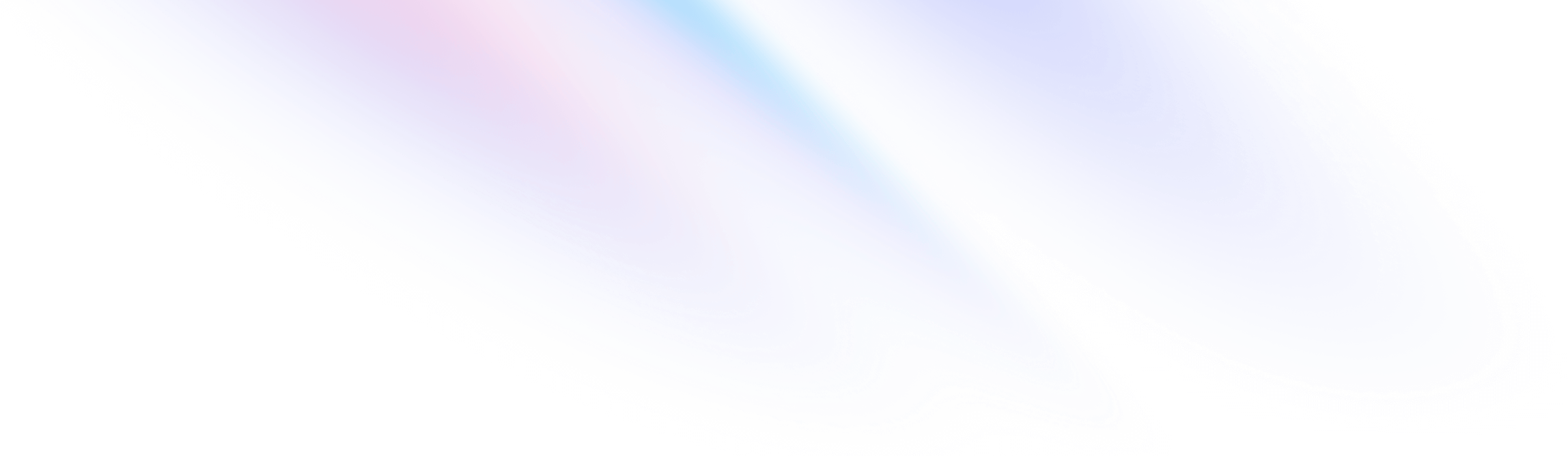
渐变色shadow
.shadow {
  background-color: white;
  box-shadow: 0 0 #bd95ff00, 0 0 6.9px #bd95ff46, 0 0 33.1px #bd95ff5f;
}
background
渐变背景色
.back {
  z-index: -1;
  background-image: linear-gradient(45deg, var(--primary), var(--quaternary) 33%, var(--tertiary) 66%, var(--secondary));
  opacity: 0;
  filter: blur(15px);
  transition-property: filter, opacity;
  transition-duration: .3s, .3s;
  transition-timing-function: ease, ease;
  animation: 3s linear infinite animateGradient;
}
@keyframe animateGradient {
  0% {
      filter: blur(15px) hue-rotate(0deg);
  }
  100% {
      filter: blur(15px) hue-rotate(360deg);
  }
}